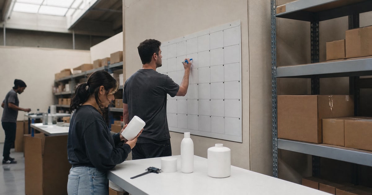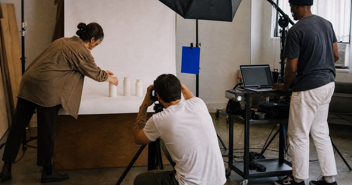
For a standard A+ layout you need five image sets: a wide banner that shows the product in use, three or four feature images pairing one benefit with one visual each, a comparison chart, brand story photography, and close-up detail shots. Build all of them for mobile first, because that is where most shoppers will read them.
The short version
- Five image sets cover a standard A+ layout. Banner, feature modules, comparison chart, brand story, detail shots.
- Design for the phone screen. A banner composed on a desktop monitor turns into unreadable soup on mobile.
- Keep text out of the pixels. Copy baked into an image cannot be translated, indexed, or edited without new design work.
- The comparison chart is the workhorse. It answers "why this one" while the shopper is still on your page.
- A+ defends conversion more than it wins traffic. If clicks are your problem, fix the hero image and title first.
The mistake that wastes most A+ budgets
The most common A+ section I see in audits is a giant banner filled with paragraphs of text. It reads fine on the designer's monitor. On a phone, where the module is compressed to a few centimeters wide, the copy is illegible and the shopper scrolls past the most expensive real estate on the listing. Treat every A+ image as a billboard seen from a moving car: one visual, one message, legible in a second.
The five image sets, in build order
- Hero banner in use. The product in its natural context, person included where the category expects it. No text beyond a short overlay headline, and even that is optional.
- Feature modules. Three or four images, each pairing exactly one benefit with one supporting visual. The benefit should come from research, not from the brochure. We pull ours from the gaps competitor reviews expose during Amazon FBA product research, because a feature nobody doubted persuades nobody.
- Comparison chart. Your product against your own range or against a generic unnamed alternative, never against a named competitor. Rows should be the attributes shoppers actually weigh, which the review mining already told you.
- Brand story set. Founder, workshop, or origin photography for the Brand Story carousel. This is trust work, not selling work, so keep it human and unpolished.
- Detail shots. Stitching, ports, seals, texture, scale against a hand. These answer the quiet questions that stop a purchase at the last moment.
Failure modes, ranked by what they cost
| Failure mode | What it costs you | The fix |
|---|---|---|
| Paragraphs baked into banners | The module is skipped on mobile | One message per image, text in the copy fields |
| Reusing gallery shots in A+ | A duplicated page that adds nothing | Shoot detail and context sets separately |
| No comparison chart | Shoppers leave to compare elsewhere | Build the chart so the comparison happens on your page |
| Text in pixels across marketplaces | New design work for every locale | Text-free imagery, claims in translatable fields |
| Skipping the mobile check | Illegible modules for most visitors | Review every module at phone width before upload |
Why the conversion work compounds
Advertising targets move as a product matures. At launch we run ACoS aggressively, because the job is market entry. At maturity the target tightens, because the job is profit. The conversion points that strong A+ images add are what make the mature target reachable without starving the listing of traffic. Weak A+ forces a choice between efficiency and volume that better images would have made unnecessary.
What design agencies will not tell you
A+ content mostly defends a sale that your hero image, price, and reviews already set up. It converts a browser who was nearly persuaded. It rarely rescues a listing with a weak primary image or a rating problem, which is why buying A+ design before fixing those is spending in the wrong order. In our listing audits, A+ quality is one of the areas we grade, but it is almost never the first fix we recommend.
The second omission: image-heavy modules with baked-in English text quietly lock you out of clean international expansion. Every locale then needs design work instead of translation. Ask any designer how their files handle a German version before you approve the concept.
Related answers
- High conversion Amazon hero images
- How to choose a team for Amazon A+ content videos
- UGC vs professional photos for Amazon listings
- Photo requirements for Amazon marketplace
- Amazon sourcing and product research services: the complete guide
When you want A+ images planned from market data rather than a moodboard, talk to Flapen.